
At Home
Building a Tonal Palette at Home
Evergreen, leather, beige, off-white — the same restraint that shapes the wardrobe shapes the room.
5 min read · Published August 2026
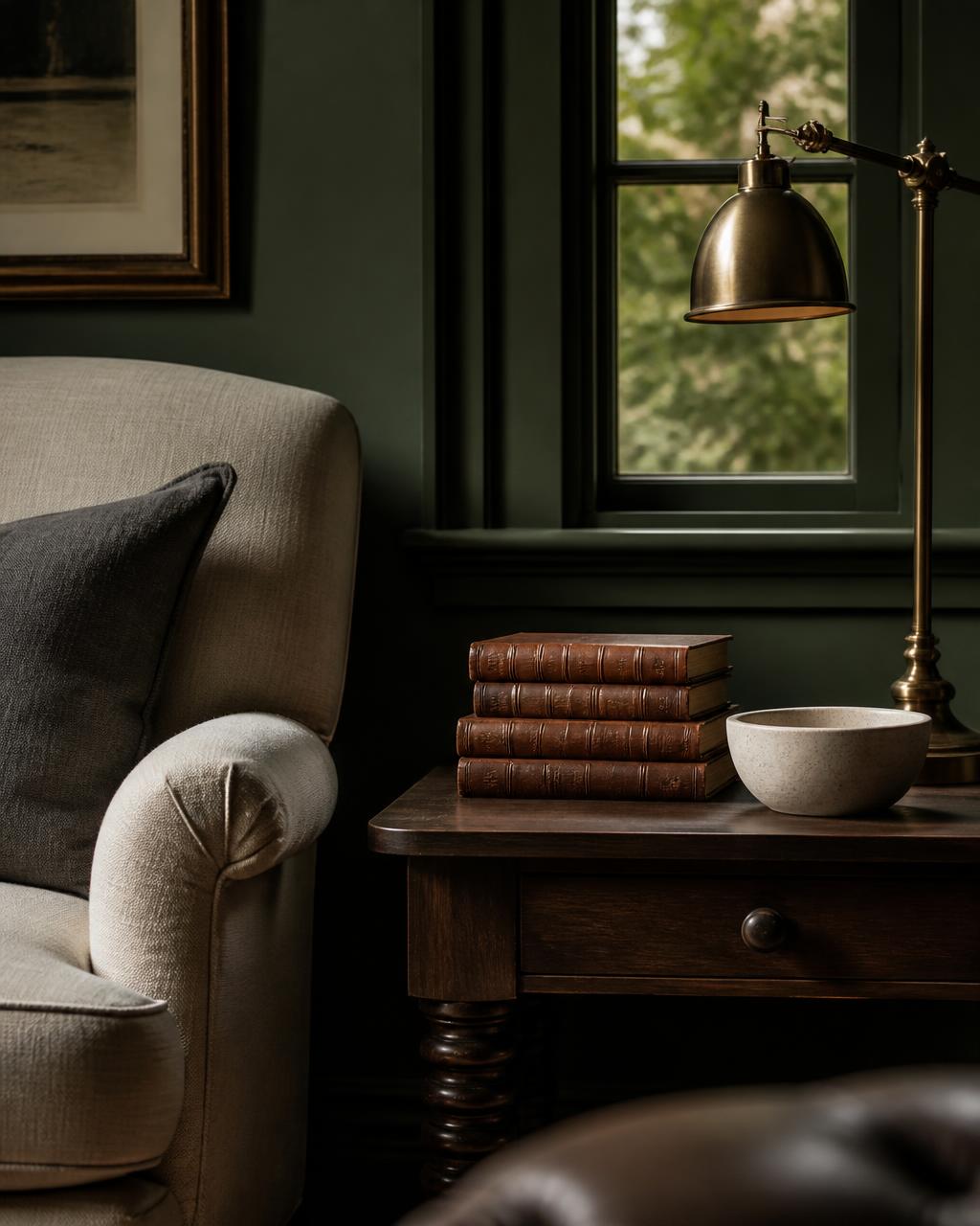
A man who has learned to dress with restraint often lives in rooms that contradict him entirely. The wardrobe has been edited down to five tones that flatter each other; the living room holds eleven that were each chosen on a separate Saturday. The discipline is the same in both places, and so is the reward: when a palette is narrow, everything inside it looks deliberate.
The house palette
At Thomas Alan we work in five tones. They were chosen for cloth, but they were really chosen for light — which is why they translate to a room without adjustment.
- CharcoalAnchor — depth and weight
- EvergreenField — the room's character
- LeatherWarmth — the single accent
- BeigeGround — soft, tactile surfaces
- Off-WhiteLight — space to breathe
Choose one field color and commit
The field color is the one that covers the most surface — walls, largest upholstery, floor covering. Pick a single one for each room and let it be genuinely present. Evergreen on all four walls of a study is a decision; evergreen on one accent wall is a hedge, and the eye reads it as such.
Deep colors are less risky than people fear, and the reason is scale. A dark green in a paint chip looks oppressive because you are seeing two square inches with no light falling across it. On a wall, the same color develops a dozen values through the day — nearly black in the corners at dusk, almost sage where the window hits it at noon. That range is the entire pleasure of a saturated field color, and it is invisible until you commit.
Let warmth arrive through material, not paint
Leather is the accent in our palette, and it almost never appears as a painted surface. It arrives as an object: a stack of bound books, the arm of a club chair, a brass lamp gone honey with age, a walnut table top. This is the domestic equivalent of adding texture rather than contrast to an outfit — the warmth is real, so it doesn't have to be loud.
The practical version of this rule: buy your accents in materials that improve. Leather, brass, oiled wood, and stone all get better with a decade of handling. Painted accents only get chipped. It is the same logic behind the pieces in a well-built capsule wardrobe — choose things that age into themselves.
Repeat every tone at least three times
A color used once is an accident. Used three times, it becomes the room's logic. If you introduce leather with a chair, echo it in a lamp base and again in the spines of books across the room, and the eye travels a deliberate circuit instead of stopping on an oddity.
This is the single most useful rule in the piece, and it costs nothing to apply — you are not buying more, you are placing what you already own with more intention. Move three objects tonight and the room will read differently in the morning.
Keep the off-white honest
Off-white is the light in the palette, and it must stay clean or the whole scheme goes muddy. Ceilings, trim, and the largest textiles should hold a single off-white — not three near-misses collected over the years. Whites that nearly match are worse than whites that plainly differ, because the eye registers the discrepancy without being able to name it.
Pick one, write it down, and use it everywhere the room needs to breathe. Restraint at home is not austerity. It is the same thing it is in dressing: a small number of good decisions, made once and then trusted, so that the room can quietly get on with the business of being lived in.